Hi guys!
Can anyone point me to some solution for creating bars and maps from live poll data? Right now we are working with csv files, but we can manage to create jsons or xmls. We are aiming to create 3D bar charts, line charts and maps of regions or counties that will update via live data feed. Before creating some solutions I want to explore some that are already made and maybe little bit automated so we dont need to start from scratch.
Thanks with regards, David!
Hi,
You can find some example projects of 3D charts at:
Tutorials\Lower Thirds
Common_Studio\Compounds\DataVis
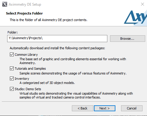
These folders come as content packages when installing Aximmetry:
You can read here about importing Excel sheets as csv file:
https://my.aximmetry.com/post/467-can-i-read-data-from-an-excel-file
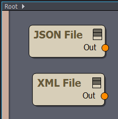
Also, there are modules in the flow editor to import JSON and XML:
Also, for the Broadcast license, we provide two plugins that do some complex data import and visualization:
Meteo plugin: graphic elements and tools specialized for weather reports, importing meteorology data from GRIB, NetCDF, radar etc. formats
Astro plugin: astronomical/astrological calculations, 2D/3D imagery of celestial systems and objects
Warmest regards,